In our previous review of the best law firm websites we focused on the technical aspects of the website including SEO elements, site security, site speed, and more.
We know that Google emphasizes responsive websites with original and useful content is the key to succeeding online. With that in mind, we focus this review of law firm websites on the overall design, ease of navigation, and the visibility of the contact information.
Without further ado, here’s the best law firm websites of 2017:
#1 Law Firm: M & A Law Firm LLC
Location: Illinois, USA
Practice: Various Fields of Law
M & A Law firm tops our list as the best law firm website of 2017. We were impressed by various elements of their responsive and intuitive site. Their front page hosts 3 unique images with bold phrases to entice visitors to learn more and get in touch. The enlarged font used for their phone number encourages visitors to get off the website in the best way possible: pick up the phone and get in touch. There was one more feature we found interesting on this website and that was their client login. Here is a law firm creating intensive relationships with their clients as well as providing them insider access to their resources as well as alternate methods for payments.
#2 Law Firm: Fogle Keller & Walker PLLC
Location: Kentucky, USA
Practice: Various Fields of Law
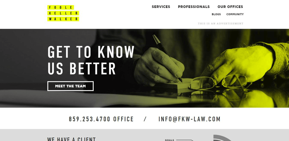
While reviewing this site we noticed that the design was centred around the rebranding of the law firm. The crisp and contrasting black with yellow makes many of the core components that every law firm website should have were popping off the page. This law firm uses language like “get to know us” to build a relationship with prospective clients the moment they arrive.
#3 Law Firm: Foot Antsey
Location: United Kingdom
Practice: Various Fields of Law
We put this law firm website on the list because the visual aesthetics of the site were absolutely stunning. From both a branding, we believe this website is superior. The architecture of the pages are easy to navigate and uses keyword phrases that get straight to the point. We feel there is a lot you can take away from the way this website was put together.
#4 Law Firm: Price Waicukauski Joven & Catlan LLC
Location: Indiana, USA
Practice: Litigation
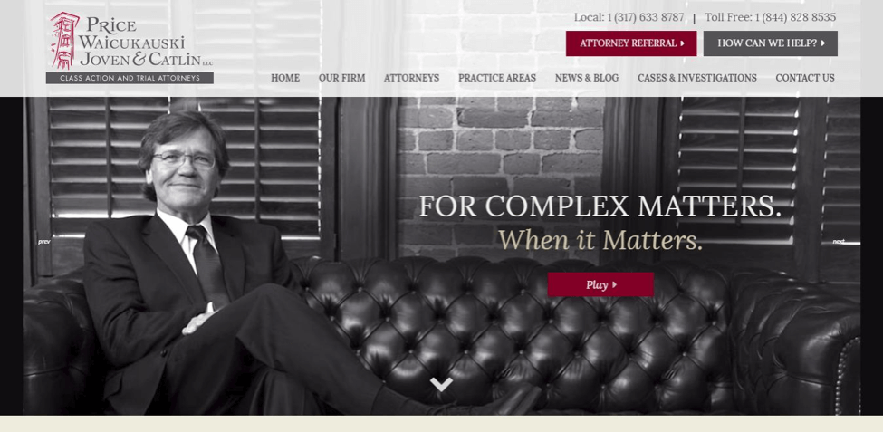
Price law is a website that gives you a lot of information. Their blogs features numerous mentions about their courtroom successes as well as informational articles for those with questions. This keyword rich website is sure to be found in the search engince. As well, the use of a sticky menu containing their contact numbers makes a clear call to action as you browse through each and every page.
#5 Law Firm: Oykhman Criminal Defence Law
Location: Alberta, CANADA
Practice: Criminal Defence
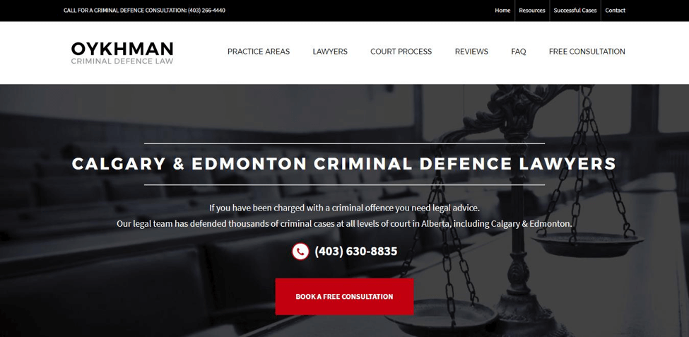
Oykhman Defence Law’s website has some key details we think all law firm websites should have. The contrast in color and design make the contact information recognizable and enticing. When we browsed through the content, we noticed it was keyword rich while offering ample information to learn more about the firm and the services they provide.
#6 Law Firm: Henein Hutchison LLP
Location: Toronto, CANADA
Practice: Criminal Defence
If you’re a local law firm with a lot of lawyers, this is a website to study. Heinen Hutchison’s is a single page style puts all the important information in clean and simple manner. Their blog showcases quality content with keywords capturing the core of what they do. If simplicity and straightforwardness is what you want in your law firm website, this is the way to do it.
#7 Law Firm: Tony Nguyen PLLC
Location: Texas, USA
Practice: Personal Injury
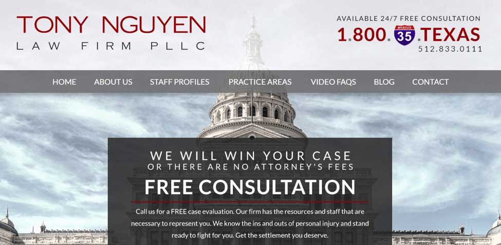
Tony Nguyen’s law firm website knows exactly what kind of clients are searching for them. Their front page features four core issues they deal with most frequently: Auto Accidents, Drunk Driving, Broken Bones, and Truck Accidents. In addition to focusing on the problems people are facing, they make it immediately clear that you’ll receive a free consultation using their unique 1-800-35-TEXAS phone number.
#8 Law Firm: Valiente Law
Location: Florida, USA
Practice: Criminal Law
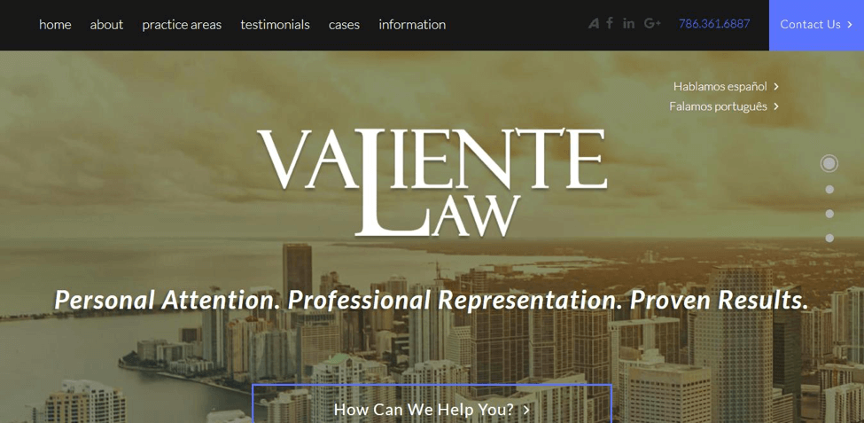
Valiente Law’s web design is very modern, responsive, and detailed. As we navigated down the home page, their past cases, and testimonies, we found our eyes looking again and again at the bright blue “Contact Us” in the top right corner. The pages make navigation through content pleasant while using the perfect amount of keywords to make this website well rounded.
#9 Law Firm: Thomas Kuttner LLC
Location: Ontario, CANADA
Practice: Labour Law
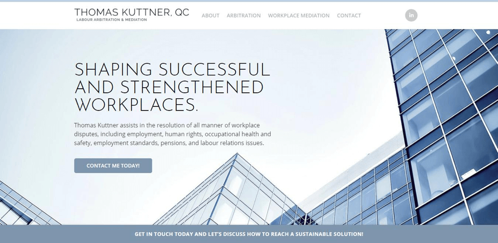
There’s something soothing about soft color blues and it makes this website both trustful and relaxing. Thomas Kuttners’ website uses just 4 pages that share the details of their service. What we think makes this site rank well on our list is their smart use of contact forms on every page. As well, they have a sticky bar in the bottom asking visitors to get in touch. This is a website optimized toward getting their visitors into prospective clients.
#10 Law Firm: Kegler Brown Hill & Ritter LLC
Location: OHIO, USA
Practice: Labour Law
This law firm website is both functional from a design point of view and practical for its visitors. The front page features a search bar for both a particular attorney or a specific practice. As you browse through their articles you’ll notice a subscription option which is a smart way for capturing committed readers who may require legal services in the future.
Wondering what the best law firm sites for 2018 will look like? We reviewed 10 more sites like the ones above which have the design, style, and appeal that will be needed in 2018.


